All Page objects will have version history. Images will also have version history. Version history will be interactive through the filmstrip user interface.
This page is very cluttered and needs to be tidied up.

User flow
How do users access version history?
"Last changed 4 minutes ago <chevron to view more>" at the bottom of the page
Small sparkline of changes, could use a minimized version of the filmstrip which will open up
Data structure
Date / time of change
Diff between current and previous will be default
revision summary input by User (basic text, not rich text)
Need to import the sketch of filmstrip timeline for version history from Sat Feb 4 2023 (pg 8)
Branching
See: Forks
Images
Images will also have version history. This will again allow users to scrub through the versions using the filmstrip thus allowing users to see the evolution of the image over time.
Competitors
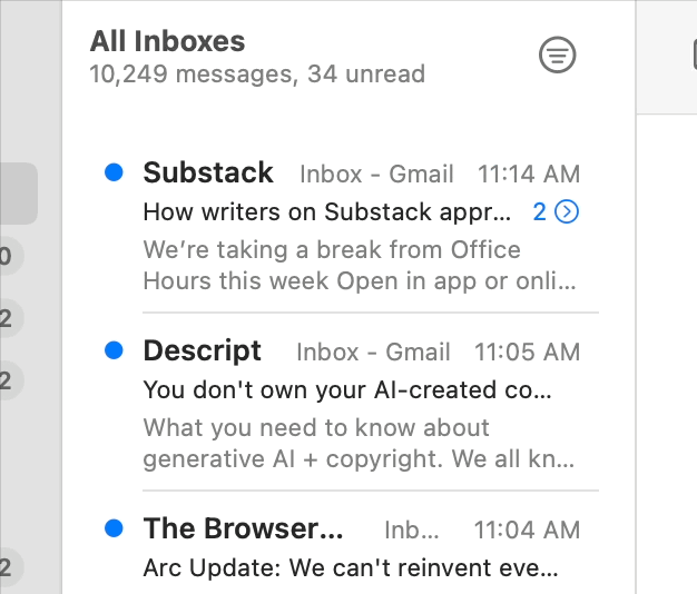
Here's how Substack handles versions of articles. They send a follow-up email to your inbox. disgusting.

Sketch of filmstrip timeline for version history from Sat Feb 4 2023 (pg 8)
Not to be confused with timeline which might look similar from a UI perspective
The filmstrip is a UI pattern for allowing users to quickly scrub through version history. It will be available on all page types as well as for images.
Apple Photo's filmstrip is incredibly powerful, you can quickly skim through thousands of photos in full-screen, as if it's a flip book or a stop motion animation. When scrubbing through the filmstrip, the user will basically see a timelapse of how the page has changed over time.

Sketch of filmstrip details: (1) shows a pinched / minimized page view (2) close-up of graph (3) progressive revelation of details after delay, to make swiping more immersive
This filmstrip will need velocity and momentum.
When in the filmstrip view, the pinch gesture will make the whole page smaller, like a minimap of the page.
Structure
Stickied to bottom of screen, on desktop it could be a floating bar which replaces the Donation bar
Horizontal scroll double-sided bar graph
Top half is green for additions (character count)
Bottom half is red for subtractions (character count)
Page viewport remains large and immersive for the timelapse effect when scrolling
Diff view
How will this play along with diffs? Will users scrub through diffs or will they scrub through states? Or perhaps this will be an option?
Perhaps the following views could exist:
Raw page
Highlighted inline Diffs
Diffs to the side (left for deletions, right for additions, given rightward motion of reading)
Diffs only
Haptics
Subtle haptic clicks could be deployed here to make the filmstrip feel tactile. This could make it even more enjoyable for the user.

here's what WeWrite is competing with. lol. MediaWiki is cringe.